Keep Calm and Carry On
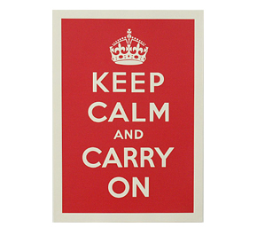
Since 2000, the WWII-era propaganda images that appeared on a number of posters loosely known as the ‘Keep Calm and Carry On’ series have been experiencing a steady resurgence in popularity. The original poster, produced in 1939, is a perfect reflection of the then and now-famous power of British resolve with those five simple words – keep calm and carry on – neatly typed beneath an image of the royal crown. Although there were others, and I love them all, this one is my favorite with its simple message to not panic. It’s an image I want to wrap myself in daily and one that is currently striking a resounding cord with people around the globe.
While the original poster was mass-produced (it’s said that 2.5 million were made), it never saw the light of day; two others that were also created suffered a similar fate. And they might have remained hidden in the proverbial closet except for one man who, it has been reported, found one of the posters in a box of old books he bought at auction. That discovery was then copied and eventually led to it being featured as a holiday gift item in a British newspaper supplement – and the imagery took off.
So what was the original intention of the series and why the strong connection to it now, some seventy years later?
I got the opportunity to interview the amazing Hayley Thwaites and Lucas Lepola of the Keep Calm Gallery in London. The gallery is run online, out of their home and features not only the ‘Keep Calm’ prints, but several other propaganda posters as well. Below is the interview, where we talk art and politics. Both, I think, are perfectly socially acceptable dinner party conversation.
danapop (dp) How do you select the artists you showcase at your gallery?
Keep Calm Galley (KC) We don’t have a set selection process as such. We seem to stumble across art and artists we love on a daily basis. The first artist we worked with on a print edition (other than our own) was Alyson Fox, we’d always been a fan of hers and we were so pleased that she was so enthusiastic when we approached her about working with us. We first saw the work of Hazel Nicholls when we were flat hunting in London and stopped for a break in a pub. We fell in love with her style instantly and as soon as we got home we tracked her down online got in touch right away. Douglas Wilson actually got in touch with us back in 2007 regarding our own prints, he was interested in ordering a few. From his email we found his own online portfolio and when we saw all of the wonderful posters he had produced we knew that we had to work with him!
We’re lucky enough to have many fantastic artists, designers and print makers approaching us with an interest to work together. We love looking through everyone’s work and seeing new things!
dp Why do you think the ‘Keep Calm’ image resonated? I mean there were two other series of images in production. Why that one?
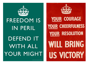
KC The real draw for most people is the sentiment of the message and the history behind the poster. For some it’s likely to be the perfect example of the British stiff upper lip, something we might like to believe is part of us. For others the message and poster is a reminder that as bad as things might get today, we need to keep in mind how things were during those desperate times, and to keep going no matter what the circumstances. Apart from the message I also think that the design itself is wonderfully timeless. The simplicity and the boldness of the layout and colour (original red) work just as well today as ever and could have just as easily been designed by any number of modern designers. I think the combination of timeless design and timeless message, along with the history behind the poster are what makes it so appealing to so many people today. I think these factors apply to the other designs in the series too, but the ‘Keep Calm’ poster seems to have come about again at just the right time for it to be taken to heart in such large numbers. Of the four posters produced in the original series I think it’s fair to say that the ‘Keep Calm and Carry On’ design is the most powerful in its simplicity. It just seems to have an effect on people, even to this day. That’s not to say the other three designs aren’t great pieces timeless pieces in their own right, hopefully they’ll see a resurgence too.
dp How do you feel that this is relevant to the political climate in which we globally find ourselves today?
KC I think you’ll always be able to comment on the aptness of the ‘Keep Calm and Carry On’ design, in relation to the political and economical climate around the world that we find ourselves in at any one time. In reality I think the design has found a place in so many homes for far more personal reasons, whether it’s something to lift your spirits on a bad day, or to act as a reminder of those family members who saw more testing times.
dp Do you feel there has been a general British reaction to the results of the U.S. election?
KC Absolutely. We would say there has been a very positive reaction here in Britain to the recent US election results. Around the time of the election we also got a feel for the reaction in the USA, just through emails from customers in the States, and reactions from artists who we work with. It was great to feel that positivity on the other side of the world, and I think it did a great thing for politics. Here in Britain we feel like there is certainly a much more positive attitude towards the USA, more so than we imaged there would be before the election.
dp Do you see the convergence of art and politics as people taking a stand? Meaning do you believe people buy propaganda posters or historical pieces such as the ones created during WWII because they understand the meaning behind them, or is it just a simplistic “it’s pretty” approach?
KC I would have to say it’s a case of being a bit of both! In the context of the ‘Keep Calm and Carry On’ design, I believe there has been a hugely positive reaction to the message behind the poster, and a great deal of interest in its history. Of course it’s a wonderful piece of design in its own right, but those who chose to display it would be hard pressed to ignore the meaning of the words and their place in history. The two of us have close relatives who served the country during WW2, so many others who display reproduced wartime posters are in the same position and like us discuss this period of history with their older generations, making these images even more personal. I guess with other reproduced propaganda posters this could be different. I’m sure there are many collectors out there with a real interest in the history of such things, but at the same time others are buying prints as ‘vintage’ decorative items, with little thought about their past. Either way I think it’s great that these posters of the past are living on and being appreciated to this day.
dp What are some of your most popular prints?
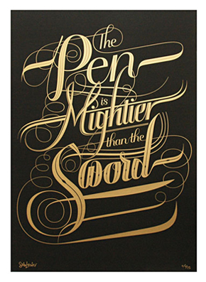
KC Aside from the ‘Keep Calm and Carry On’ reproduction prints we are lucky enough to sell prints on behalf of some fantastic artists and designers. Many of the prints which we sell or have sold are produced in small limited editions, so it’s difficult to compare their popularity when the editions have been sold. One of the most sought after prints which we’ve sold lately is Seb Lester’s ‘Mightier’. Seb has given this wonderful phrase a beautiful treatment, and the print quality is second to none (we can’t wait to get ours on the wall)!
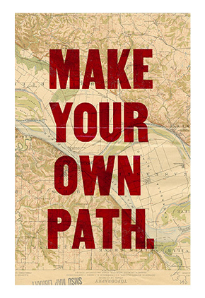
Douglas Wilson’s ‘Make Your Own Path’ letterpress print has also been an extremely popular choice. Each has been printed by Douglas onto a section of a vintage map taken from his own collection. Many customers are keen to get their hands on a specific type of map (if available), and others enjoy the lucky dip aspect, waiting to see what style of map they get when the print arrives. The message, combined with the uniqueness of each vintage map makes these a very popular choice!
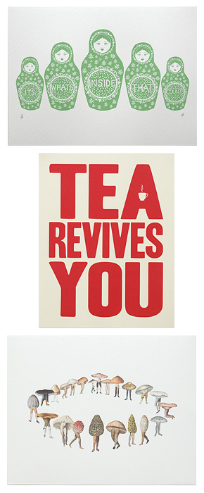
Some of our other more popular prints include ‘What’s Inside’ by Hazel Nicholls, a really sweet nesting doll themed design, printed by the artist herself. ‘Fairy Ring’ by Massachusetts based artist Amy Ross is another recent favourite of ours. The most popular print by Hayley and myself is our twist on an old 1930s advertising slogan ‘Tea Revives You’, screen printed in a range of colours, but bold red has always been our favourite.
Of course popular prints are always changing. One of the best parts of running the gallery is putting new things online and waiting to see how customers react. It’s hard to judge what’s going to be popular and what will not be, so we try not to think about it too much and just enjoy the surprise!
dp Who is mostly purchasing these types are prints – geography? Demographic?
KC We don’t tend to collate too much information about our customers, just enough so that we can get their prints to them. Around 60% of the prints we send out are to customers based in the UK, mainly in London. The majority of the remaining customers are based in the USA, Canada and Australia. Lately we’ve seen quite an increase in the amount of orders coming from Scandinavia, I think the style of many of the artists and designers we work with is very suited to Scandinavian tastes (without generalizing too much)! Many of the overseas customers are ex-UK citizens, I think they like to have something on the wall to remind them of home.
dp Who are your favorite artists? What inspires you?
KC Aside from the artists we work with there are many whose work we admire. We have an oil painting by Jen Garrido hanging proudly in our living room. It was purchased not long after we started the gallery and it’s one of the most beautiful things we own, we spend so much time just looking at it! Anthony Micallef is a fantastic artist who we’ve always followed his charcoal portraits are absolutely brilliant. Jason Munn and Wayne Pate are two artists producing lovely screen prints right now. If we had much more wall space we’d have a lot more of their work up. Hayley has degree in Art History, and her artists and pieces can be found in the work of the Ancient Greeks, the French Impressionists, Japanese favouite Ukiyo e-print makers, modern day street artists, and everything in between.
We draw inspiration from so many things which we like to surround ourselves with. Just a few of the things in particular which we take inspiration from would be, vintage postcards, Victorian silhouettes, old advertising slogans, bold typography, paper ephemera and being in London.
dp A lot of your images have typography, are you especially drawn to the design element in relation to the words vs. image?
KC I wouldn’t say its a case of words versus image, but yes the gallery does seem to be very heavy on the typography side of things. We love words and images in equal measure, but I think there’s something about typography in design that’s coming about again today, which is influencing a lot of artists and designers. There’s something about the immediacy of the written (or typed) word, which has a universal impact. People say that a picture speaks a thousand words, but sometimes only a few words are needed.
dp A little background about your gallery – who runs it and what roles do you play? What are your hours of operation and do you have a physical gallery location?
KC The gallery has been run by just the two of us (Hayley & Lucas) since day one. We’re a couple, but we’re also business partners, which can be interesting but we like it. It’s difficult to be specific about our roles, they cross over so much and we collaborate on just about everything, from designs, to emails, from wrapping orders to doing accounting. I think we need each other to get things done in this way, it works well. As it’s just the two of us and we work from home our hours of operation can often go on and on. Typically we get to work before 9am, but will work late into the night, often past midnight. The day to day running of the gallery has become quite time consuming, so we’re left with the evenings and nighttime to work on new prints and projects. We do work weekends, but try our best to keep them as free as possible.
Unfortunately we don’t have a physical gallery space at this time. We run the website from our small Victorian terrace here in East Dulwich, London. It’s our home and office, we’re surrounded by prints, packaging, and two crazy kittens. We love working from home, and are happy to invite customers to stop by and collect their orders, but sometimes the idea of a physical gallery space is appealing. That said, I think the possibility of a physical space is some way off in the future, I don’t think we’d want to open a gallery/shop in the conventional manner and we wouldn’t want to manage a space unless we were sure the website wouldn’t become neglected and vice-versa.


