Contrasting Clay
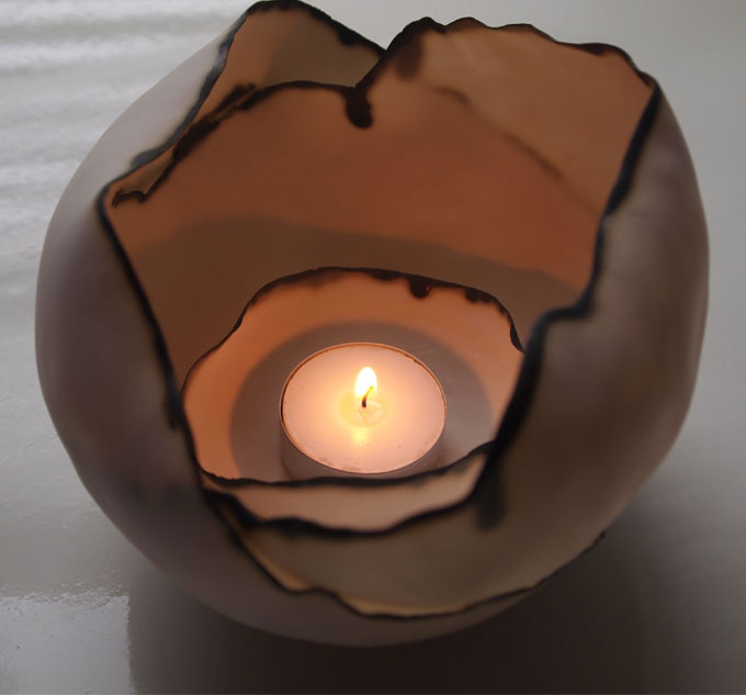
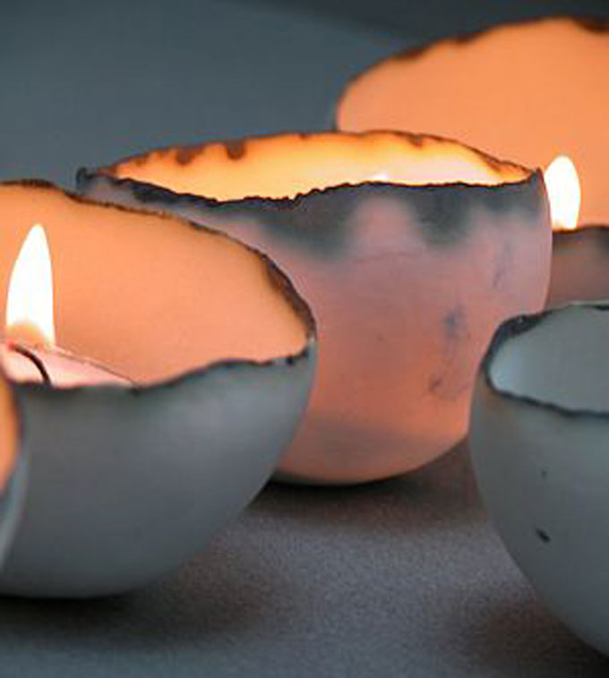
Last year, my friend Eimear gifted me three shell tealights from Sinead O’Moore. The trio lives on my mantle, and I enjoy the complexity of the pieces every time I pass. They seem so frail, almost on the verge of cracking, but the scorching elements that come from the firing also make them seem so sturdy, as if they could actually survive anything. I got the chance to interview O’Moore about her painstakingly beautiful work. I do hope you enjoy the description of her craft and thoughtful answers as much as I do.
danapop: I find your work a fantastic juxtaposition of being very delicate, yet rugged at the same time. Can you describe the process of making one of your pieces and the inspiration behind them?
Sinead O’Moore: Mainly I make two types of forms, small tealight shells & column vases with bends.
The tealight shells began life chunkier & cruder, initially made in earthenware. Once I started working with porcelain I began to investigate the material properties – strength & translucency. So working with the clay the aim was to see how far I could push the clay while still retaining strength. Using a mould to press a piece of porcelain in to, I then start pulling it away, working with my fingers until the porcelain is nearly skin thick and I can sense the mould through the material. Suctioning the form out of the mould while still very soft I then manipulate the form so they are irregular. Once they are dry I tidy the edges and biscuit fire them. After the first firing they are still very delicate and this is where I have my most breakages as I sand the outside before applying the oxide edge and re-fire to the high temperature firing. Finally I give them a final sand so they are smooth to touch on the outside.
By using my fingers and the clay body as opposed to a clay slip, the piece has naturally different thickness that creates a soft cloudy effect when lit by a tealight. Also there is individuality to each piece, which you would not achieve with a slip cast piece. The porcelain being so fine will bend and move in the high temperature firing. This can be seen clearer with the larger bowls. To make these I use a wooden tool to peel back the porcelain, so I need to listen as well as use the sense of touch, before I tear through the porcelain and have to start again. These are more organic as the slight curve I add while they are soft will move and exaggerate with the temperature in the kiln. On the final firing what I put in the kiln may be completely different to what I take out. These larger bowls have developed further by joining two/three bowls when they are semi soft clay, playing with how they move in the kiln and then how the light glows through the porcelain. Ideally they should evoke a sense of fragility while being strong in comparison to their thickness.
In the small tealight shells range I also use white earthenware, this gives a different look and feel. The material is solid, no lights glows through. Using the earthenware allows me to use low temperature firing crystalline glazes, which are a high gloss finish. I apply the glaze to the inside rather than outside & sand the raw clay body with a fine glass sand paper to produce a smooth tactile surface to the outside.
The vases are the other forms I make. Predominately I worked in porcelain, as I love the feel of the material and the beauty of the natural clay body. While making some straight cylindrical vases with strong lines etched into the surface, I decided to see how the lines would change with the form if I altered the form by adding bends and folds. Porcelain is not a very forgiving material, if you wait too long to add the bends it will crack along the stress lines, too soon and they slump. Also putting too extreme a bend they will topple in the firing. So it really is the case of respecting your material and working with it rather than against it. I sometime make the vases in a rough stoneware “crank” material, this is playing with the contrast of the materials, how similar forms vary visually and touch by the use of the base material.
Adding the copper oxide to the single lined vases highlights the lines while contrasting with the clay body. Over time I have been refining them, making the bends “softer”, adding in a “plinth” type base section, sanding the surface between firings and after the final firing to the top part of the vase while leaving the bottom section as is. My thoughts are ceramics should be tactile; you should want to touch them. Having different textures in the form adds to the piece in a sensory sense, I hope. I can generally see/feel the mood I was in when I made each piece/group.
I suppose throughout my work there is a split personality. Strength v’s Fragility, Refinement v’s Raw, Rough v’s Smooth, Respecting the material while pushing it to its finest limit. Constantly I am looking to see how to develop my pieces, making little changes and adapting them.
danapop: In today’s world of Internet shopping, which markets your product around the globe, how do you stay true to yourself as an artist creating individual pieces from your own hands while keeping up with the demand of getting your work to the masses?
O’Moore: This is a very timely question, as it is an ongoing question I ask myself and I am certain it is a question many makers battle with.
Putting a business head on, the answer of keeping up with the demand of getting your work to the masses is to either employ someone to help with the making, or outsource some of the making to manufactures. This might make it more viable to run as a business if I want to meet the masses at the cost they are now. Some ceramicists produce two ranges, the manufactured version of their designs and the handmade side. The two different ranges are priced accordingly.
If I think as a craftsperson/artist, I make ceramics because I love working with clay. I do not want to lose contact with the clay or have my pieces lose their integrity, which is a fear if I go down the manufacturing route, which will alienate some customers. At present, I sell to beautiful small shops and galleries where people who buy the bowls appreciate the handmade and their individuality. The online business is still predominantly UK based, where people have come across my work elsewhere and approach me then via the Internet. So I think the answer might be not to aim to over take the world with little tealight bowls and look at how to progress while retaining myself as the maker/artist of a strong small business.
Images: Courtesy of the artist
Ugh, Uggs
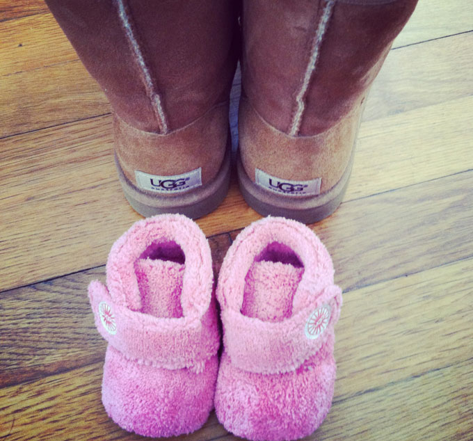
I have a love hate relationship with Uggs. Meaning most people love them and I hate them. It doesn’t get much more ugly than a glorified moonboot, and style-wise that’s absolutely what they are. The only exception is baby Uggs, which are just the cutest things ever.
I wholly believed all this until I had the baby that wore the Uggs. On social media, more than once, I’ve knocked such Ugg disasters as the I Do wedding collection and its collaboration with Jimmy Choo. Now, I cannot get enough.
I’ll even admit to having not one, but now two, pairs myself. I’ve now become the person that goes from my Ugg house slippers to boots and back to slippers again. Both pairs are like slipping into a stretched out sweatshirt or your favorite pair of jeans, each looking a little worse for wear, but there’s no way you’d part with them.
I used to think Uggs were made for high school and college girls living in either the Midwest or California, but no, they were created for moms. I wear them to the grocery store, to yoga, to walk the dog around the neighborhood. Seriously. All. The. Time. I caught a glimpse of myself in the reflection of a car the other day while walking Otis, and I hardly recognized myself with my yoga pants and Uggs pushing a stroller. If only my 20-year-old wild self could see me now.
And when I’m at the aforementioned places, I see all the other moms doing the same thing. It’s like our own secret code of yeah, we’re too tired to even tie our shoes, but man, these boots are cozy and warm, no matter that they are super ugly.
Ugh. Uggs.
Lucky 13
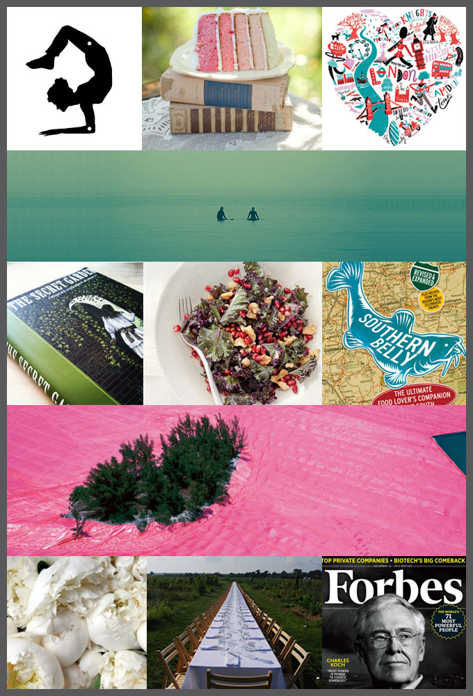
For the past three years I’ve compiled a vision board at the start of the New Year. Here, you can see 2010, 2011, and 2012. While I do think January 1 is a day just like any other, it is still a chance to start fresh with a metaphoric clean slate. In the past, I’ve tried to give my boards a bit of balance between personal and professional. This year is no different.
If you look the right way, you can see that the whole world is a garden.
– Frances Hodgson Burnett, The Secret Garden
Trend Alert: Chevron
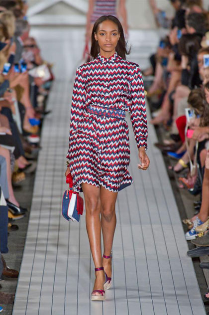
Who knew Charlie Brown was on fashion point? The chevron stripe is blanketing everything from apparel to home décor of late. I started noticing the print on summer dresses and flowing tops, then on interior goods like rugs and curtains. It appears to be sticking around way past summertime’s mint and pale pink pastels and into deeper colors for fall like burgundy and midnight blue. I totally get the appeal.
On apparel, it’s a flattering pattern, where a standard stripe can sometimes be tricky to pull off (ever notice how thick prints can weigh you down?). And on home accessories like bedding and accent pillows it’s a no brainer because it has the ability to hide imperfections (like dog hair on a duvet and a red wine stain on couch pillows).
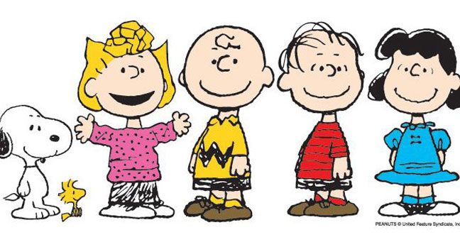
Apparently pushing fashion boundaries runs in the Brown family as Sally, Charlie’s younger sister knows how to rock a polka dot dress like no other.
Images: Tommy Hilfiger Spring/Summer 2013 NYFW courtesy of weloveweddings.omaha.com, Peanuts © United Feature Syndicate
Controlled Chaos
Today is a new beginning of sorts. A fresh look to danapop. To mark the occasion, I cannot think of a better first post than to share all the hard work that’s been going on behind the scenes of my house.
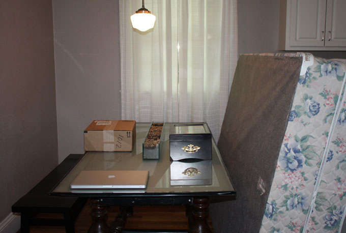
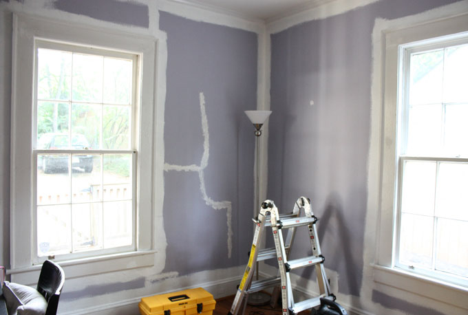
This is what my house looked just a few days ago. Yes, that’s a mattress and box spring and bed frame in the eat-in-kitchen. And the desk in the middle of what’s becoming the nursery? Oh that’s just the home office for now. My favorite piece of furniture, my grandmother’s chair was blocking our front door until it recently headed to get reupholstered. In other words, don’t even try to come over to our house right now. We likely won’t answer. (Unless you’re here to pick up the mattress.)
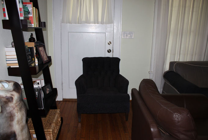
We live in a 2 bedroom, 1 bathroom 1941 bungalow, which I’ve touched upon before. So, when we discovered we were pregnant, of course space came to the top of our minds. Our house is just fine with a baby. And in fact, the thought of putting our house on the market and everything that goes with that is so overwhelming to me with all the other changes, I don’t think I could’ve gone that route without having some sort of nervous breakdown.
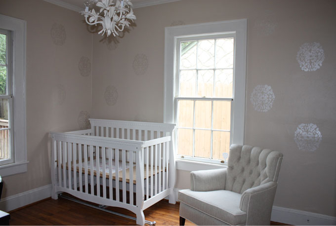
My good friend Heather Hogan Roberts of HHR Interiors (and also principal of Ivy and Vine) envisioned the home office and nursery concepts, which we couldn’t be more thrilled about. While progress is being made, all it is too premature to post. Plus, it’s frustrating to me sometimes when all you get on websites are before and after shots like there wasn’t this whole window of time when your house looked a bit chaotic in the middle of the renovation. Because real life is an office in the middle of a room, a box spring in the kitchen, and doors that are all missing their knobs. Here’s to the hope that the “after” is all worth it, and in our case, the “during” is already looking great.
Walking with Reindeer
For four years photographer Erika Larsen immersed herself in a project about the Sámi, the semi-nomadic reindeer hunters living on ancestral ground between Sweden and Norway.
Her beautifully quiet and poignant collection of images capturing the indigenous daily life of the Sámi is about to be released in book form. I was fortunate enough to interview this talented shutterbug about the Sámi way of life, her book, and the duality of beauty in the wild.
Single? Change.
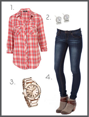
No, not change your personality, but your outfit. According to comedian and writer Mindy Kaling’s fun read, Is Everyone Hanging Out Without Me? every male writer she’s worked with puts their female characters in dark wash jeans and a button down. It’s the girl-next-door fantasy outfit. The ensemble is approachable, but apparently still has a hint of sex appeal (just make sure the shirt is tapered for a fitted look).
After I read the book I started noticing the trend on television shows. Practically every sitcom character from Modern Family (Claire, not Gloria), to syndicated Friends episodes with Monica rocking some version of this, to Liz Lemon’s dowdy version on 30 Rock, wears the common thread of jeans, a plaid button down, and classic jewelry. Who knew it was the guys dream attire for their future girlfriend?
Though, as simple as this outfit is, it’s sometimes just as fun (maybe even more so) to hear what clothing guys hate courtesy of manrepeller.com.
1. Longsleeve Check Shirt, Topshop 2. Classic Caroline Studs, Swell Caroline 3. Camden Watch, Nixon 4. Denim Skinny in Heritage, Shop Sosie
Best of the Fests
If you would’ve told me this time last year that I’d be about to cover a four-day music festival on a 700-acre farm in the middle of Tennessee for work, I’d think you were crazy. And after you read the danapop piece slated in a couple of weeks in which I drop a bit of news, you’ll realize I am in fact the one that’s nuts.
Yes, I’m headed to Bonnaroo. While covering an event like this is incredibly rewarding and certainly one of the perks of the job, it’s very hard work. It’ll be filled with loads of running around to secure interviews, capture specific images, and well, just being in the right place at the right time. I cannot wait to see Radiohead, Bon Iver, the Avett Brothers, Rodrigo y Gabriela with C.U.B.A., the Temper Trap, the Shins–and oh my goodness–Kenny Rogers and Alice Cooper. It’s going to be amazing.
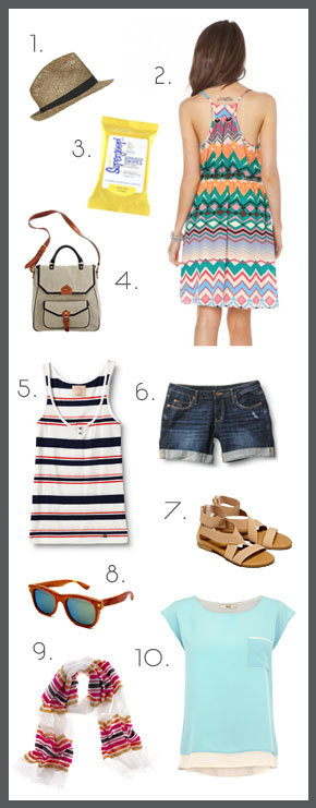
For all the running around, I know I’ll need a few great pieces to wear throughout the long days and nights in the sweltering Southern heat. The clothing needs to be lightweight and practical, while also still being cute and professional all at once. That means my beloved wedges are obviously out, as are stifling synthetic fabrics. As much as I want to pack this donut (I’m obsessed with this girl’s tutorial. Not sure if it’s the accent or the braces or her use of the phrase “bobby clips,” but I think it’s hilarious.) though, I’m afraid it should be saved for a fancier occasion where tank tops and Toms aren’t involved. Well, that and the fact that I chopped off some significant inches last week, inspired from this chic style, here.
Hairstyles aside, are you headed to a big music fest this year? Here’s the roundup of festival clothes and accessories ready for the packing.
1. Seagrass Trilby, Topshop 2. Tribal Zig Zag Strap Dress, Shop Sosie 3. Dr. T’s Supergoop! Sunscreen Swipes, Beso 4. The Canvas Snapshot Bag, Madewell 5. Ahoy Stripe Tank Top, Quicksilver 6. Gypsy Tour Thresher Nap Shorts, Quicksilver 7. Elastic Strap Gladiator Sandal, American Eagle Outfitters 8. Wayfarer #31, Deck Specks 9. Lemlem Losha Gauze Scarf, J. Crew 10. Double Layer T-Shirt, Oasis
It’s My Party
And yes, you most certainly have every right to cry, pout, or even be a hysterical mess if you want to. But, why? I used to be one of them. One of those stressed out control freaks (ask anyone) when I hosted people in my home. Honestly I think I made everyone around me (including the dog) uncomfortable with my nervous energy and unwillingness to just re-to-the-lax.
I think the idea of hosting an event–no matter if it’s inside your home or at your favorite restaurant–is to make people feel comfortable. It’s a chance to loosen up a bit, to come together and create a memory beyond watching “Girls” off the TiVo with a couple of Ritter bars and one glass of red wine too many. Ahem, no judgment here.
Through the years I’ve hosted or planned my fair share of baby showers, dinner parties, restaurant opening parties, and cocktail happy hours. The universal guidelines remain the same. Here are a few tid-bits I’ve picked up along the way…
Wedge Explosion
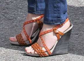
I’ve had a pretty steady relationship with the wedge sandal. I’m certain my penchant for them has something to do with the fact that they are a petite girl’s best friend. For starters, wedges are so much more comfortable than a stiletto, but they still give added height. I have several pairs that make me inches taller that are so comfortable I can sport them all day. My first pair back in high school was so heavy I remember packing them for a trip and feeling like free weights were tucked inside. They had zero give and were what I suspect to be the equivalent of walking on cement blocks, but I loved those wedges and wore them until the straps were falling apart from the weight of the thick sole.
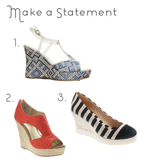
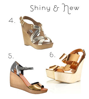
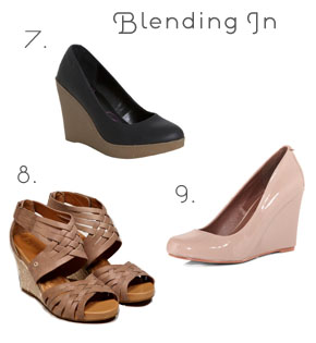
Nowadays wedges come in just about every color of the rainbow and every style imaginable–from slip-on to T-strap to woven espadrille-style heels. It’s not hard to find a pair to match every occasion, no matter if it’s dressed-down denim shorts for a barbecue or paired with a summer sundress fit for an afternoon wedding. Here are my favorites.
1. Coconuts Vice Wedge, Swell 2. Seychelles Memories of You, Piperlime 3. Seville Canvas and Satin Wedge Espadrilles, J.Crew
4. Steve Madden Tampaa, Piperlime 5. The Metallic Streetside Sandal, Madewell 6. Wowza Metallic Wood Heel Wedges, Topshop
7. Ciao Bella Black Leather Hartmen Rubber Wedge, Bluefly 8. Indigo by Clarks Sky Pocomo Wedge Sandal, American Eagle Outfitters 9. Nude Patent Wedges, Dorothy Perkins
Reese Witherspoon Wearing Wedges image: girlstalkinsmack.com


